

STATEMENT: When a designer can thrive off the the provided constraints they have fully embodied the title of "Designer."
The first image is a poster that Milton Glaser made for a show of his work. It is his textual logo overlaid onto some other elements. I really like this piece because he has extracted the rhythm of his name, MIL-TON-GLA-SER , and created an extremely balanced and cohesive work. I also noticed that the poster that is hung up around the building for visiting artist Martha Rosler employs this same technique
I also chose this logo for New York designed by Milton Glaser. After I heard his description of how the three elements in the logo work together to make a lasting impression in the viewer's brain. First, he states the word "I" is also just one letter and therefore a symbol. The heart shape is a symbol that is universally recognized as love, and the letters "NY" is an abbreviation that has become the symbol for New York. These three tools used by Glaser make the logo an ingenious creation that has an everlasting effect on the viewer.
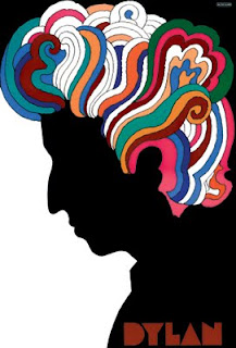
This third work is a poster of Bob Dylan that Glaser created for CBS records. This work is extremely famous. Many people from the 60's will say that this single image embodies the era of great talent and the inspired youth. Glaser was older at the, but was able to perfectly capture the pulse of the generation. For me, this is one the biggest aspects that makes a designer successful. Being able to walk in someone else's shoes and relate to things that may be alienated from you are essential in being a successful designer.
No comments:
Post a Comment