BE: I am painting and print-making concentration. I mostly have prints here. All this stuff here was probably done within the past year because paint and print working, the first couple times you do somehting you just learn the technique.
DR: Right, focus on the process.
BE: So, I didn't want to bring out still life pieces, because it's not relavent to what I was really doing. What is here i thought was important because it was kind of more autonomous work. So I'll start off with this. This is a really large painting. It's like 4 feet by 6 feet and it's based on a Photoshop image that i made in Photoshop and painted. Its a building merged with a plant underneath it, we had to mix an architectural piece,and a natural piece, but we make it totally unrecognizable. First everyone in class lost their shit becuase it was a 4x6 painting, but this was actually a starting off point for a lot of things for me. I never thought to use Photoshop before to make a painting. You're always taught to paint from life, so to have someone tell you that you're going to paint a picture and it's actually so much harder because when you have a picture you can't make a mistake. The comparison is so obvious, you know?
DR: Exactly, if this angle is here it has to go there.
BE: Right, so I was working off an image that was this big and i have to convert it to a 4x6 so it was really challenging but super rewarding. This is still one of my favorite paintings because it was a lot of assingment work, but what i learned from this painting and kind of where it brought me was an invaluable learning experience. I learned a lot about what I am good at, like these little areas i think are the most successful, like these little tiny variations, and i mean those areas are probably like that big and they are like 50 colors. So I learned that I am a really good tight painter and I'm really good with lines. I mean I thought I sucked, and I don't apparently. So painting from a photo was a big thing we learned in that class.
DR: Right here you can tell you really understand color theory. This red part look like a red overlay applied in Photoshop and it looks like how the colors would change would that effect.
BE: Great, yeah and that's another challenging thing, thank you. So this was like a big jumping point for me because I think it informed the rest of what I make in painting at least. So we learned about why you normally should not paint from a photograph if you don't want it to look like a photograph. We learned how photos have glare, they have blur that youre eyes don't. You're eyes view everything in focus, you know, nothing is out of focus, and those are the things you don't really think about. People are like " oh, pictures are exactly what it is." No, it's not there's a huge difference. In photography the colors are more muted. most of the times when you print out a photo its not as brilliant as it is on the screen.
DR: Absolutely, I remember Westfall told us that, especially in black and white paintings, the shadows that fall on a person's face especially around the mouth will all be the same kind of black. That really stuck with me because as I think of ways to render things I realized that it was very true in work I had done.
BE: Yeah, this class, painting II, it just really propelled the way i felt about photography. We did that assignment and then for our final we could do whatever we wanted. So, i guess a lot of my work up until last year it dealt a lot with my family. My parents are from Italy, so I'm a first generation American, so a lot of my work dealt with that whole culture. As I dealt with the culture, some times it was humorous and other times it was more serious like these little zines i made for print. Its silk screen covers.
DR: You used photo-stencil?
BE: No, this is handdrawn. these are both hand drawn.
DR: Oh, you cut it out of paper?
BE: Well, you take mylar and then you just draw with a sharpie. You expose it and then print it out.
DR:Oh, yeah photostencil
BE: Yeah and you can just draw with a sharpie or like an ink and pen and ink and then when you expose it you can print it out. The only difference is its hand drawn versus printed out of the computer. So you had to make these two little zines and all of the stuff too that I was doing when i was referring like being italian, it's funny because they use alot of these gaudy like flowers and theres a lot of excess and everything's flashy and over the top. So that ascthetic was kind of what i was doing for a while. These two you can obviously tell they are like super flamboyant like especially that one. This one is a little more serious zine..
DR: Is this the translation of what's written at the top.
BE: No the bottom is the hail mary in Italian. It's the real important, being Roman Catholic and being Italian are like one in the same and its always a really important part of my parents cultures you know the Virgin Mary. So the bottom is the hail mary and the top is actually a quote from this guy. He was talking about Mexican immigrants in the U.S. and he was saying we need to kill them, they need to get out of our country. They have no problem killing you and taking your money and like selling drugs. Then I contrasted that with the Hail Mary and inside here these are all family photos and also this is like the table cloth that my parents have, this is another, like a lace. These are all textiles from my house, my real house and these are all real family. These are my grandfathers. These are all family photographs and some of this is funny like the cheetah print. It's not always really sophisticated stuff. It's normally like low class. So with that i was making a political statement about immigration
DR: The paper was actually gold that you used?
BE: Yeah this is gold paper. I contrast it with really crappy computer paper. Again, I guess this book was like mostly about contrast in that way like this ones really geometric and you know the lace is very like...
DR: Yeah, I mean that's what I see throughout all your work. I see a lot of texture and a lot of contrast between organic forms and regular ones.
BE: Yeah, yeah, and I think in a lot of ways, subconsciously I was kind of contrasting like their life back in their home country to life here which is so much more advanced in terms of technology. This was a more serious approach and these bells and little pompom are also a reference to Italy. In sicily they have a lot of these donkey carts and they're decorated with bells and pom poms. Then this one was more funny. This is a cover says, "pray for us," thats what it means and it's a prayer book but its all existentialist phliosophers that don't believe in god.
DR: Oh, I see.
BE: And these words are like a dada poem. You put them in a bag and you have to take them out and however the words come out is how the poem is. That was part of the assignment we had to do a dada poem so i thought that was appropriate because these are all like their writings like Kafka wrote "The Metamorphesis," and you know Beauvoir wrote the "Ethics of Ambiguity." The text doesnt make any sense and I thought it was kinda like tounge and cheek. Oh, it's a prayer book but you know it's about atheists. I'm always kind of going back to that like tacky astetic and it was well understood and to me. It was like funny. I made these little borders out of cloth and then Xeroxed them and I drew these little things and I Xeroxed them on so you know it was funny and they're cool to have to give to people. You can prob have one if you want to take one.
DR Okay, great, see there's some design.
BE: Yeah, I mean there's design everywhere, you need to think about that. Sicily's the shape of a triangle. Then those were things I probably did the in the beginning of print class and these two prints were at the end of that same class. This is, again I'm still sticking with that kind of funny over the top asthetic and it's actually a play off of like a cropped portion of my parents wedding photo. They got married in this hall in Brooklyn and they had this horrible Pasley carpet, and my mom had this crazy lace dress. So there's a lot behind this and I thought it was funny nobody. Nobody else thinks it's funny but I thought it was funny. This is a photo etching. This was actually a plastic table cloth I bought at C.H. Martin and then I dipped it in paper making pulp so it kind of hardened and became its own pattern, but the lace pattern still held through so I took photographs of this table cloth and made a photo etching and I think these all kind of relate to each other because they all really have that floral pattern, like almost a domstic feel too. I feel like I was referencing a lot of feminine imagery.
DR: Absolutely, and I don't know if nostalgic is the right word, but this work definitely takes you to a place.
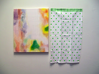
BE: Yeah, it's definitely referencing the past for sure. Then I started to move on. This is my painting final for Painting 2 and what I did was I took a swatch of fabric that I found on Joann Fabrics.com and in Photoshop I took them and broke them up into like little squares. I changed every single square with value and stuff.
DR: So this whole thing was the pattern on the fabric and you chopped it up.
BE: Yeah, and the two were different patterns. They were both floar patterns obviously, so what I was trying to do here was take something that was really old really old fashioned and then kinda of reference digital photography with pixilation and how like everything gets grided up. The problem was it became really decorative and I still feel like in a way these failed in that sense. They are just really decorative, they're something you can put on your wall or you can buy this at a TJMAXX, or something. They are just really pretty but I don't think they got across what I wanted to get across. I felt as if I was stilll really holding back in terms of my painting application. It was painted really controlled, some parts were really washy and some parts were opaque.
DR: I really like it and I really like the color handling, and that was something for me when I came here that skyrocketed my work, was understanding color theory.
BE: Yeah definitely, I think it's also really important to paint with a full palette. This is how I start painting. I lay out every color paint that I have if I don't mind up using it for that painting. It's just a dot so you're not wasting it. Like now know i have all my reds and I have all my greens. Julie taught me that nobody has a memory for color, we don't, it's just not in our brains, so you're never going to remember, like I'm going to forget that I have that one green. You know what I mean? So at this point, in this juncture, I was still trying to combine images and I was using Photoshop as a tool and I still am. I think it is so important because painting has gone so far, like people said like Jackson Pollock was like the death of painting because what do you do after him you know?
DR: Of course, my brother's actually named after him.
BE: Jackson? Thats awesome. i wish i had a cool name like that. So like a lot of people were saying like what do you do after Jackson Pollock. You know and its true, in a lot of ways like what do you do after Jackson Pollock. But to me the advent and the accessibility of digital imagery and photoshop is the new frontier for painting and I feel like if you're going to be a painter today you have to reference digital imagery and you have to reference technology because it's the only things that seperates you from somebody that worked two hundred years ago. Like why are you relevant if you're not using it you know, it's a waste. A lot of painters have a prejudice against digital images. Oh its not real, its from a computer its not real art. Fuck that, it's like the opposite of what i think. I think you need to use the computer to make images. It's also important to reference digital imagery.
DR: Exactly, what's the next step. I'm using the same tools they used 200 years ago.
BE Whats the next step! Oil and canvas so what the fuck are you going to do thats different. Totoally. That was my whole thing for a while and it still is.


